Findings
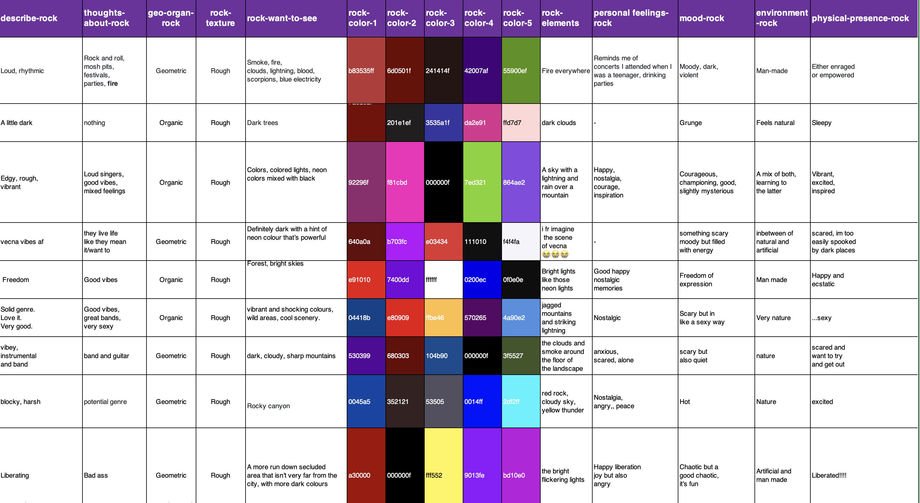
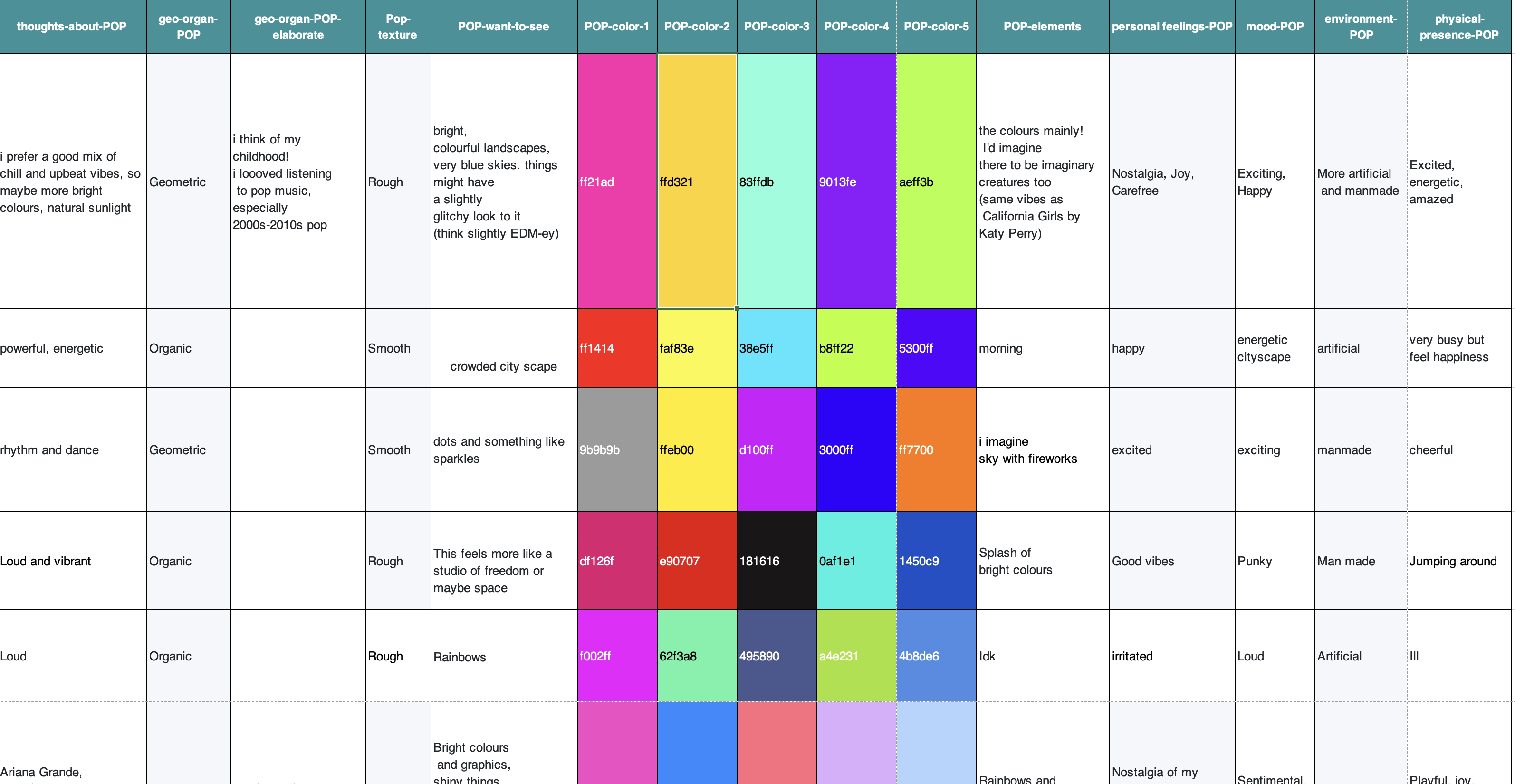
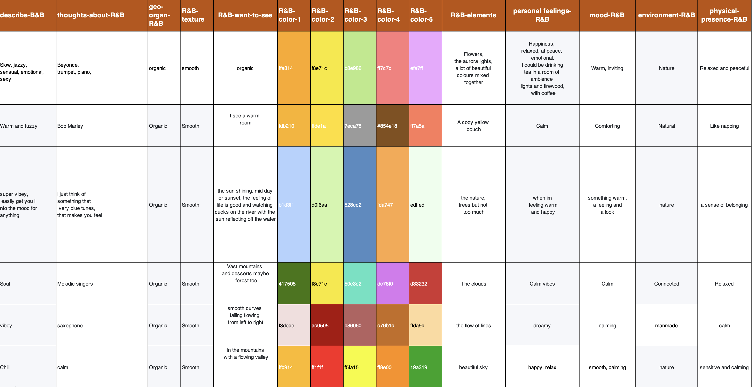
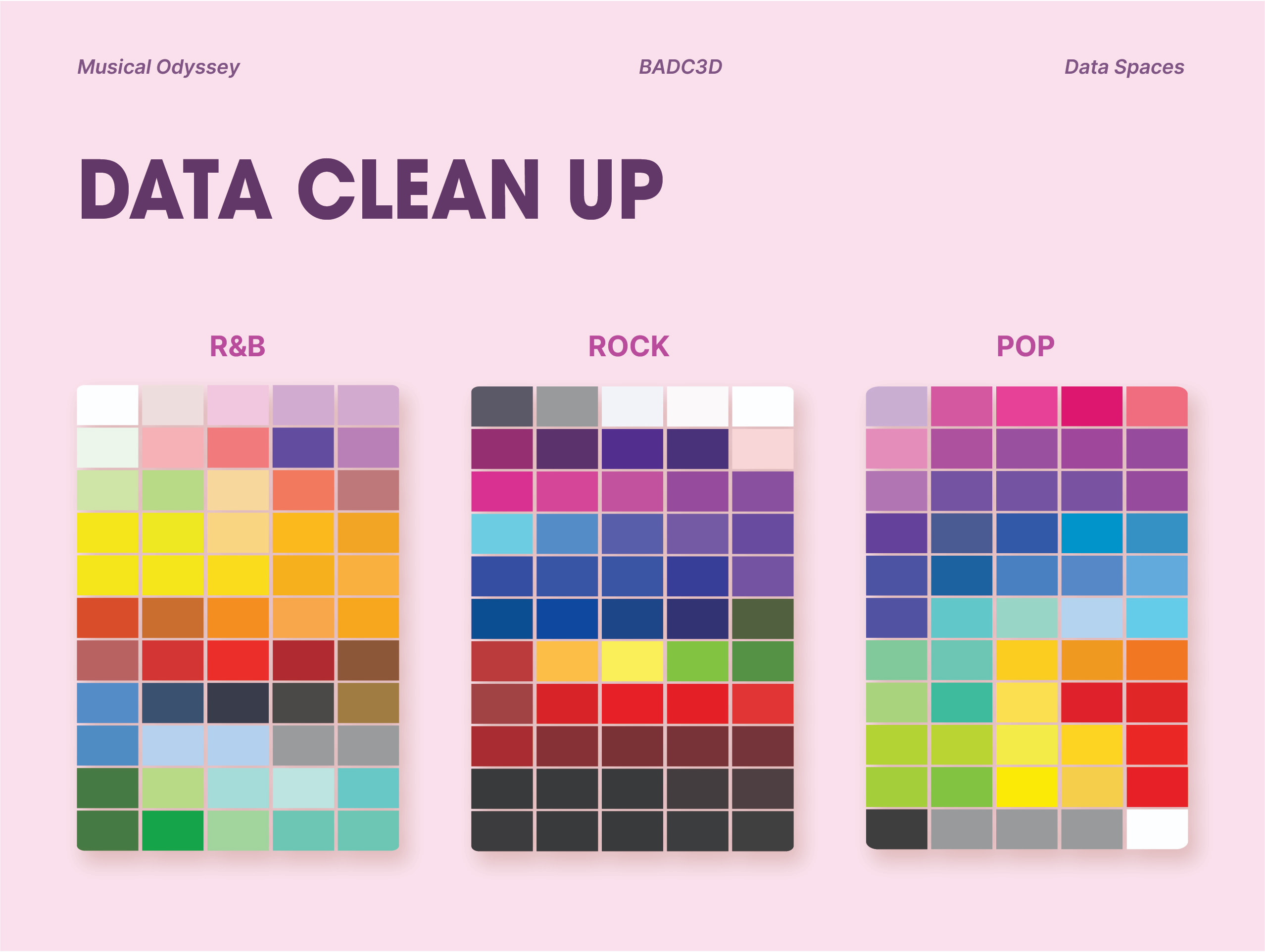
After collecting our data, we organised and sorted them accordingly. This goes by our determined parameters first, and then by the variables we defined in our data form. We exported our data in excel where we examine our data in order to move on to visualization.
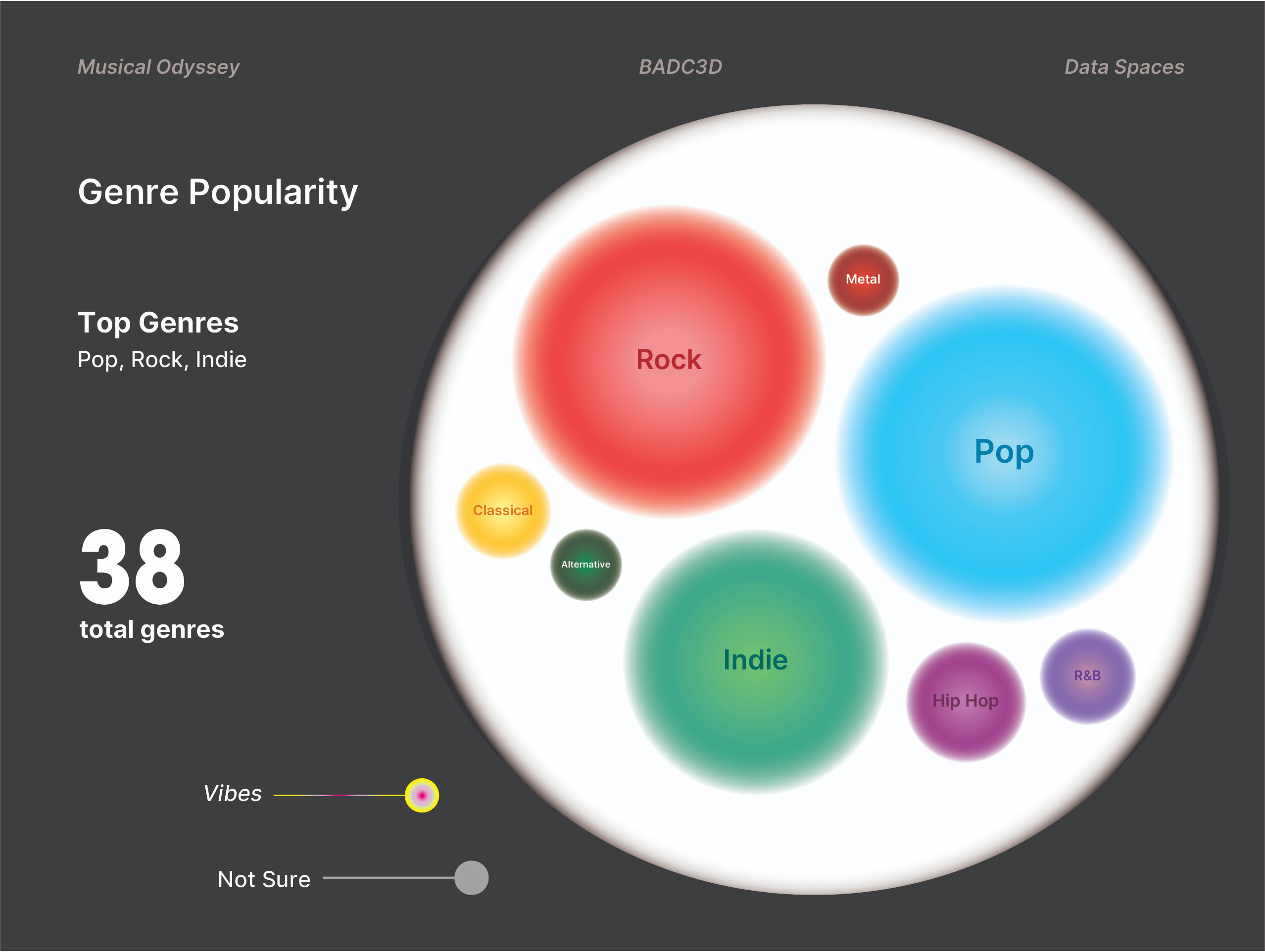
In the data visualization, beyond our main project objective, we made sure to maximise our data by trying to look at what else our data can teach us. What trends can we observe from the data? Is there a connection between the individual perception of music to that of a collective perception? Are there specific elements or attributes that people relate to certain types of music? Why?
Data Insight
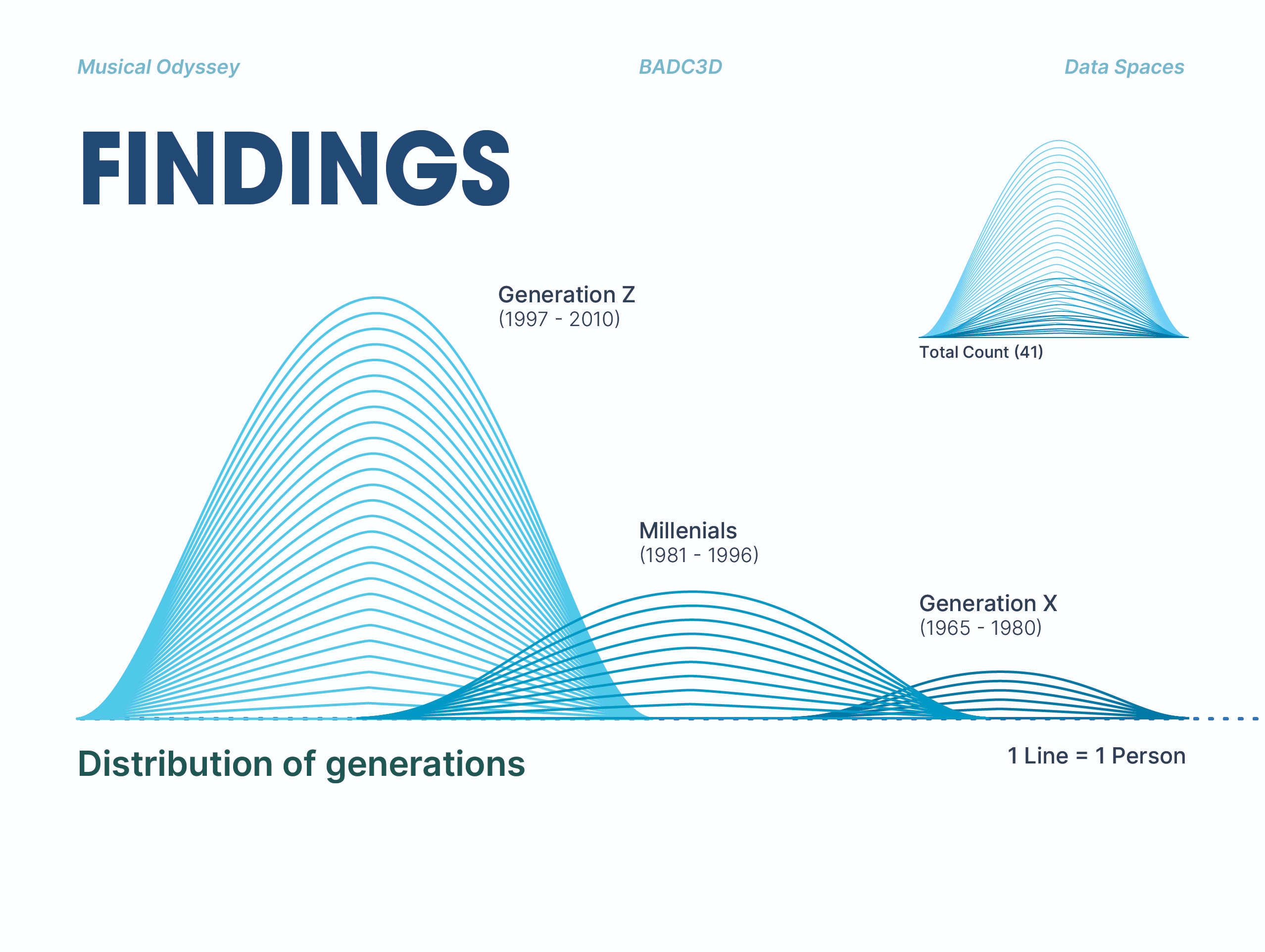
Firstly, our main parameters were by the defined generations (Generation Z, Millenials and Generation X) and the musical genres (Pop, Rock and R&B). However, despite extending our survey to many, we still lacked in equal data from each generation. Majority of our data came from people who identified from the Millenial generation. Due to this disparity, some (but not all) of our data was affected. Along the way, we decided to remove the generational parameter and focus specifically on the music itself and peoples' perception of it.
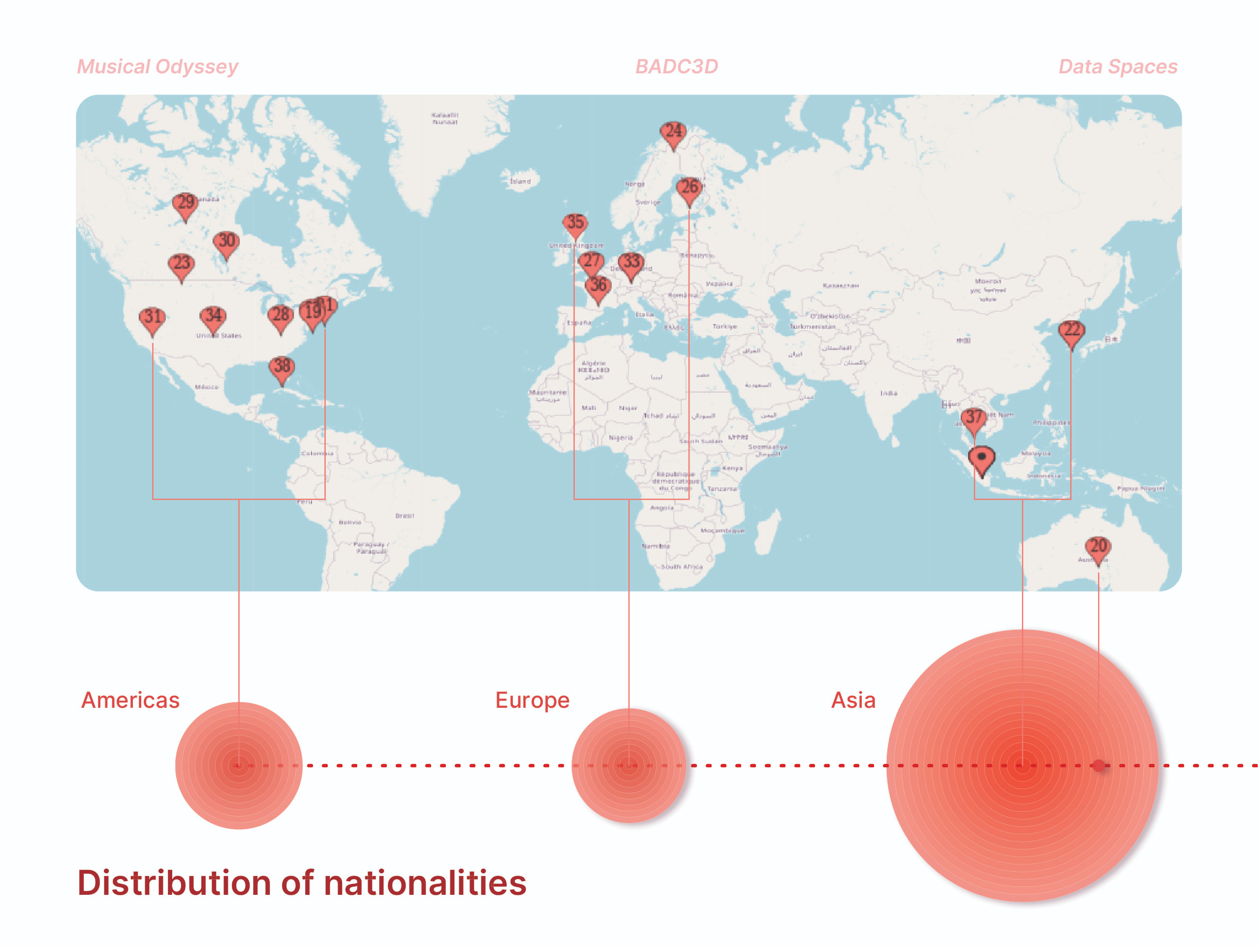
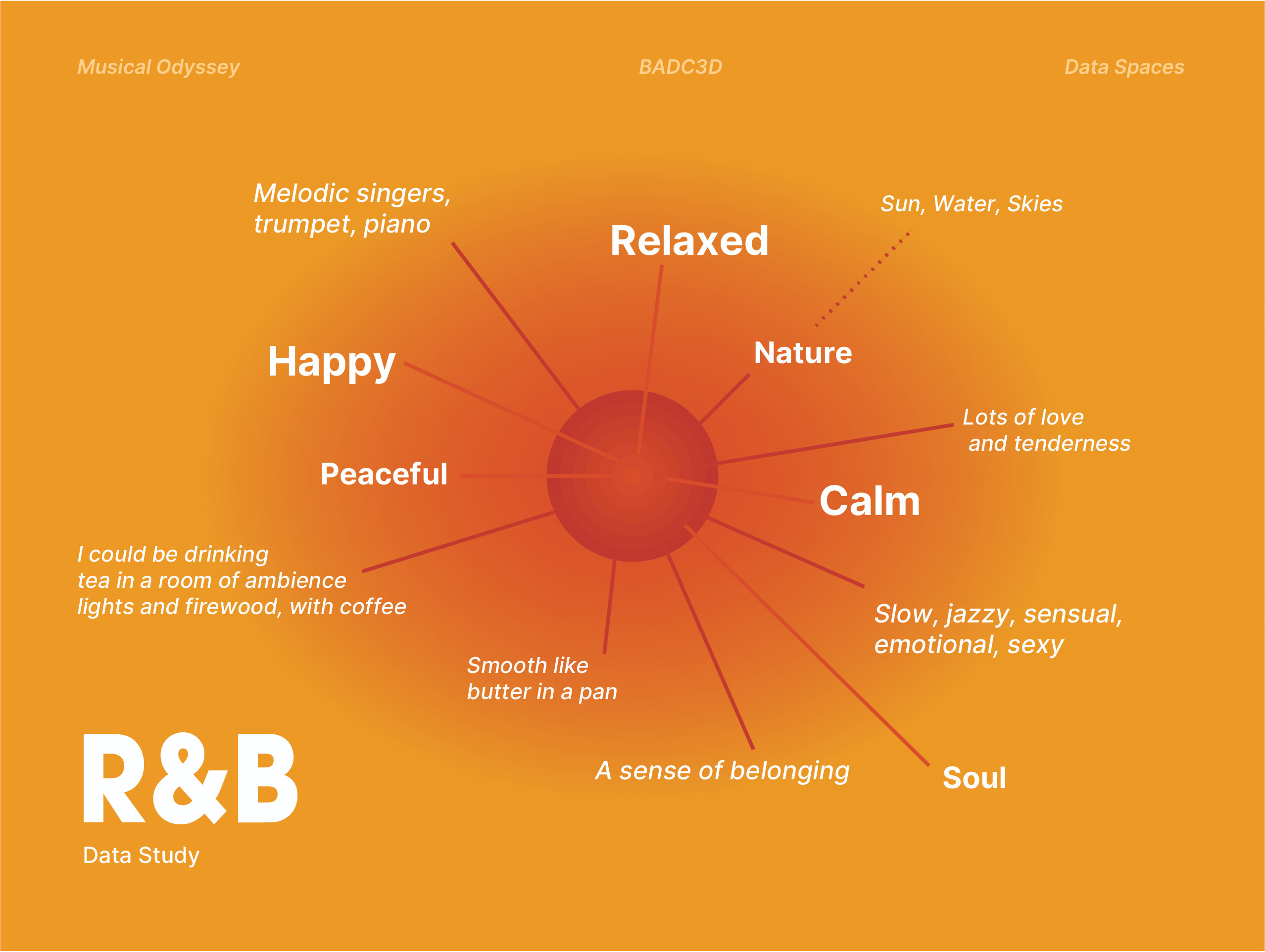
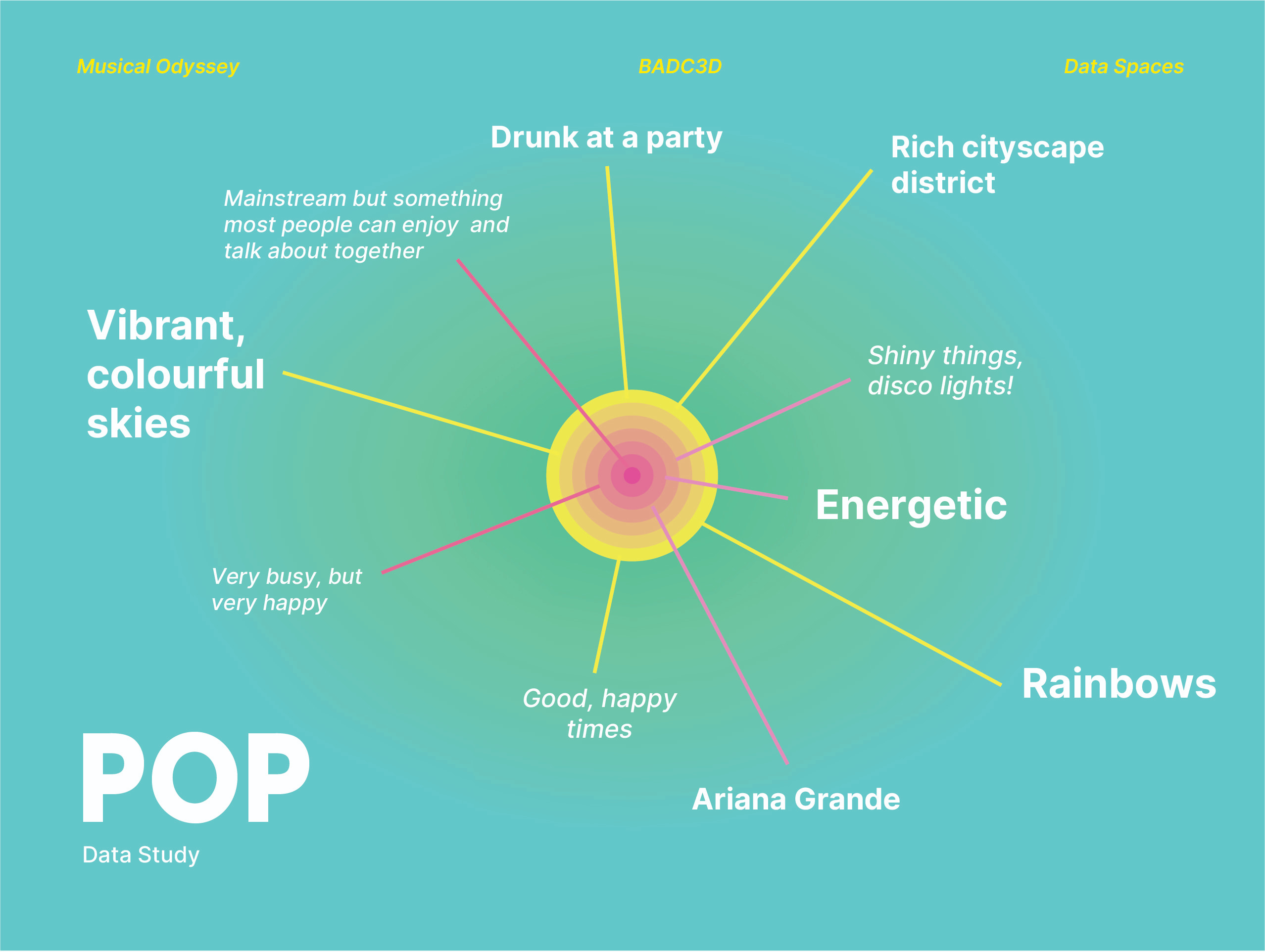
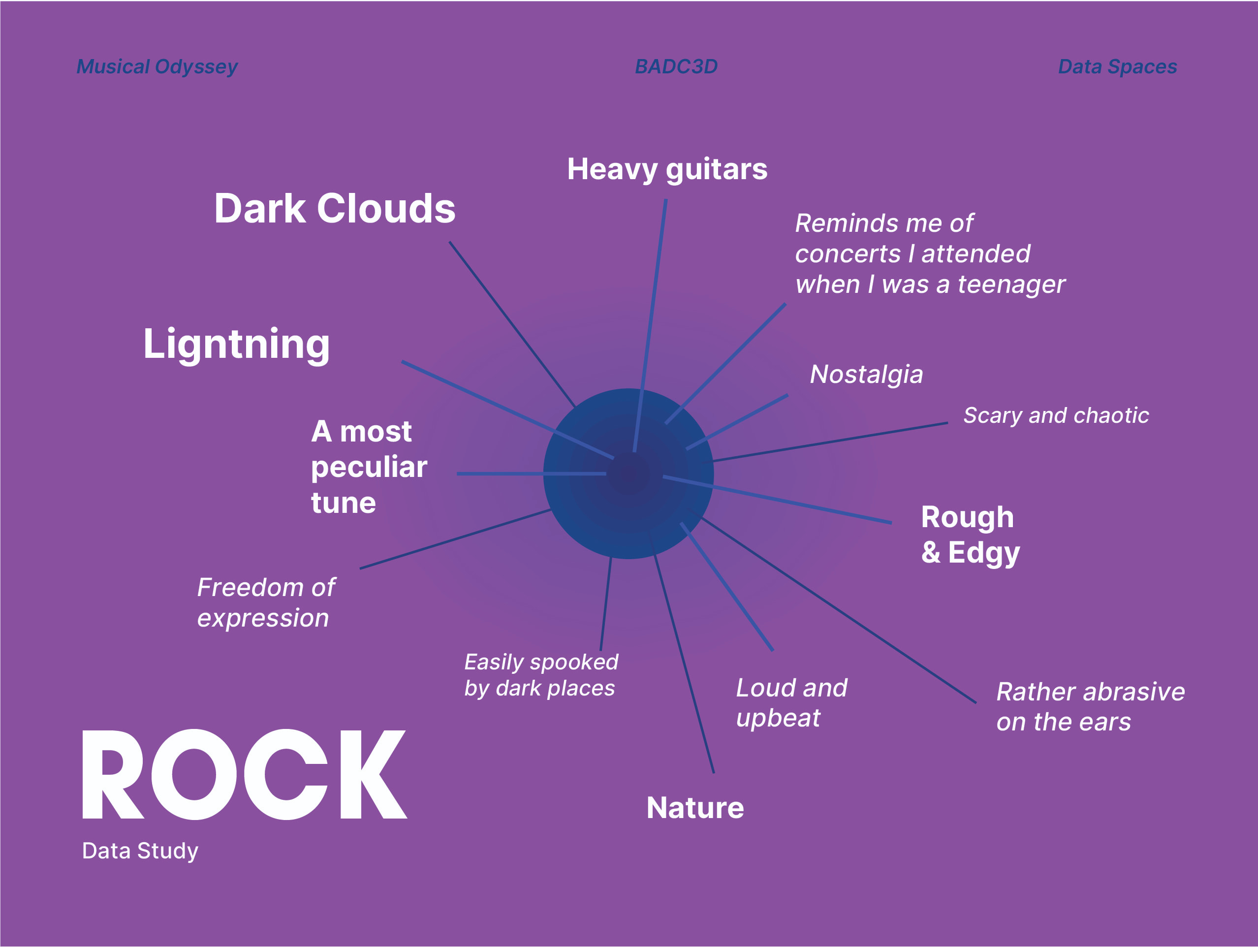
Secondly, due to the tight timeline, we also resorted to crowdsourcing our data online, apart from sending it around organically. This allowed us a greater reach, not only in terms of diverse generations but also from different parts of the world. In each genre, despite the differences in locations, age ranges, personal preferences and background knowledge, there were many commonly recurring answers or themes that people responded with.
Design Decisions
Aesthetics
The general look and feel of our landscapes will mostly be determined by the responses of our participants. This means that all the variables entered into the AI have to be determined by them. As a group, we agreed that in no way can we influence or affect our participants' opinions with pre-conceived notions. We want their honest reactions and thoughts, so that the landscapes remain as genuinely accurate as possible.
AI Engines
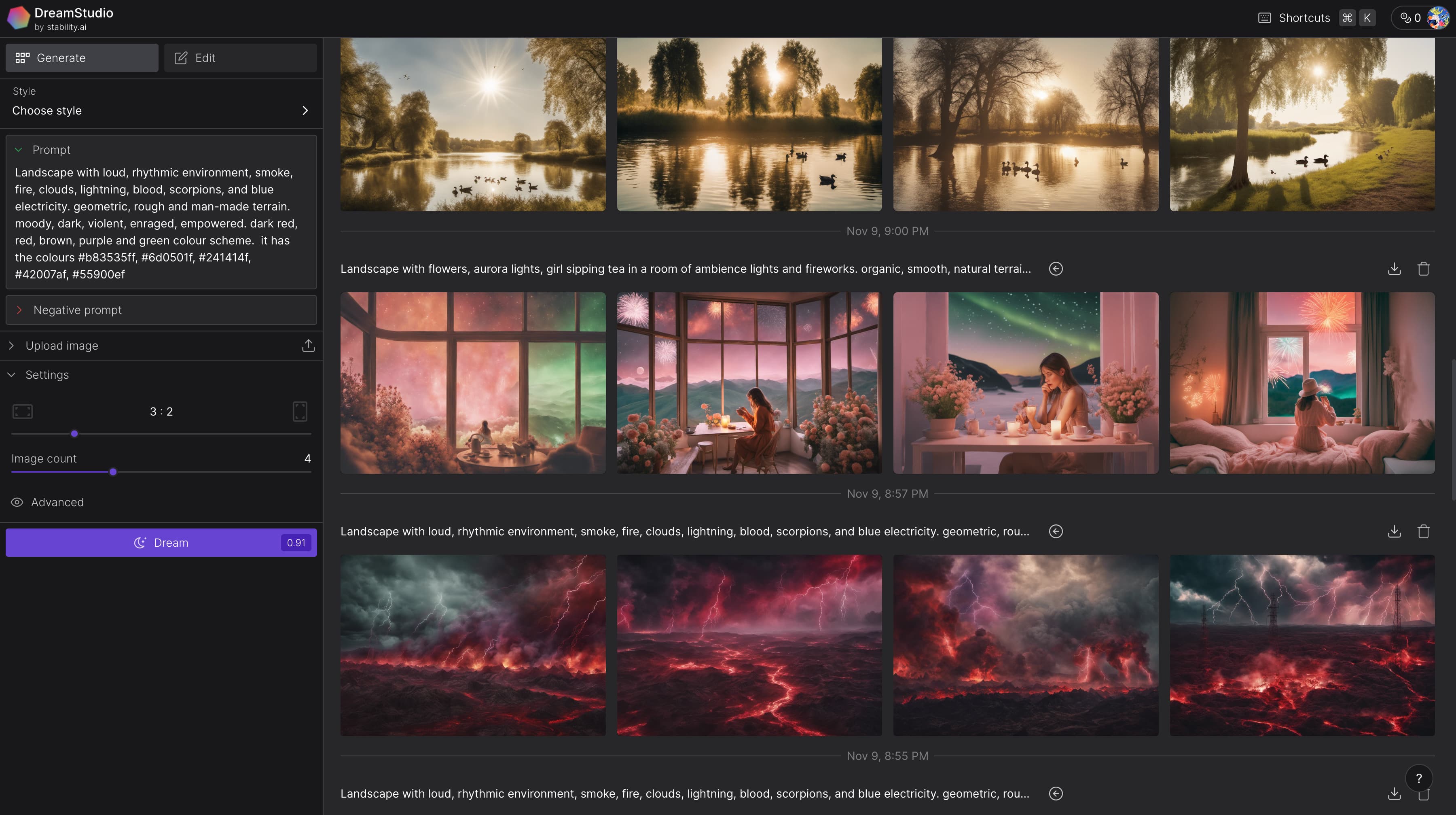
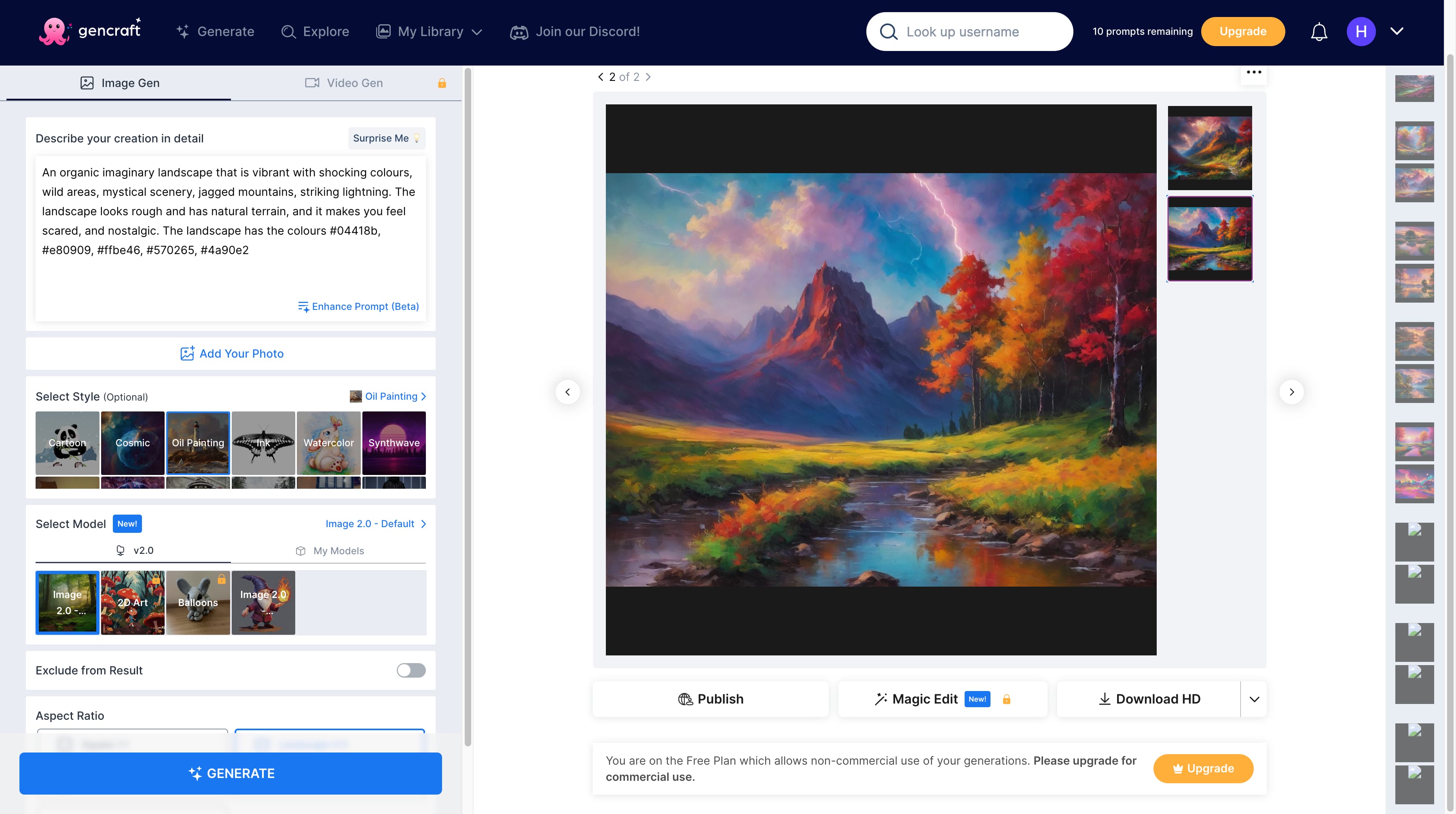
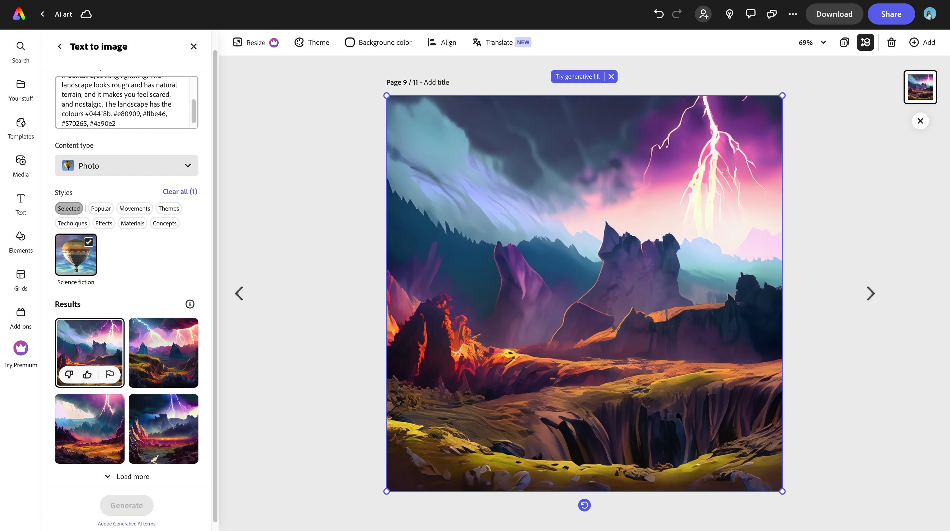
Our role is focuses more on the generation. While we do not restrict the visual aesthetics of the images, we have to ensure a consisten style of image rendering among the images by using the same filters of platforms. Certain engines have vastly different styles and formats (such as 360 degrees images), and to ensure that the images look like they come from the same, or at least similar engines, we have to maintain a visual cohesiveness among those in the same genre.
Data Sorting
A part of the design relies heavily on which sets of data we want to use. Not all of our data will qualify to be useful in this project, especially in the generation prompt template. Omission of certain data is not to say that it is useless, but rather not as meaningful as other fields that will help shape the imagery of the landscape better. As the archive of generated images also act as data, the process of organising and utilising the images was also an intentional decision.
Interactivity
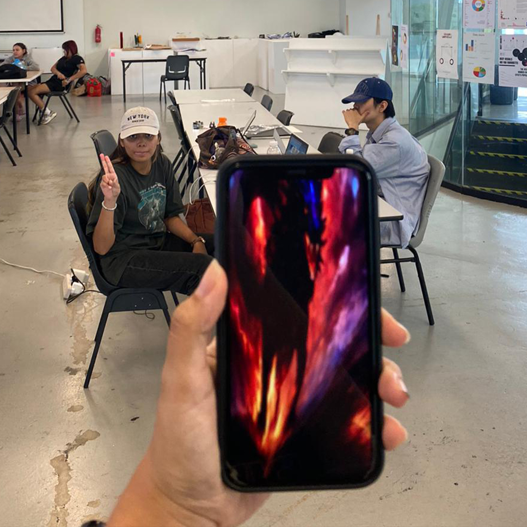
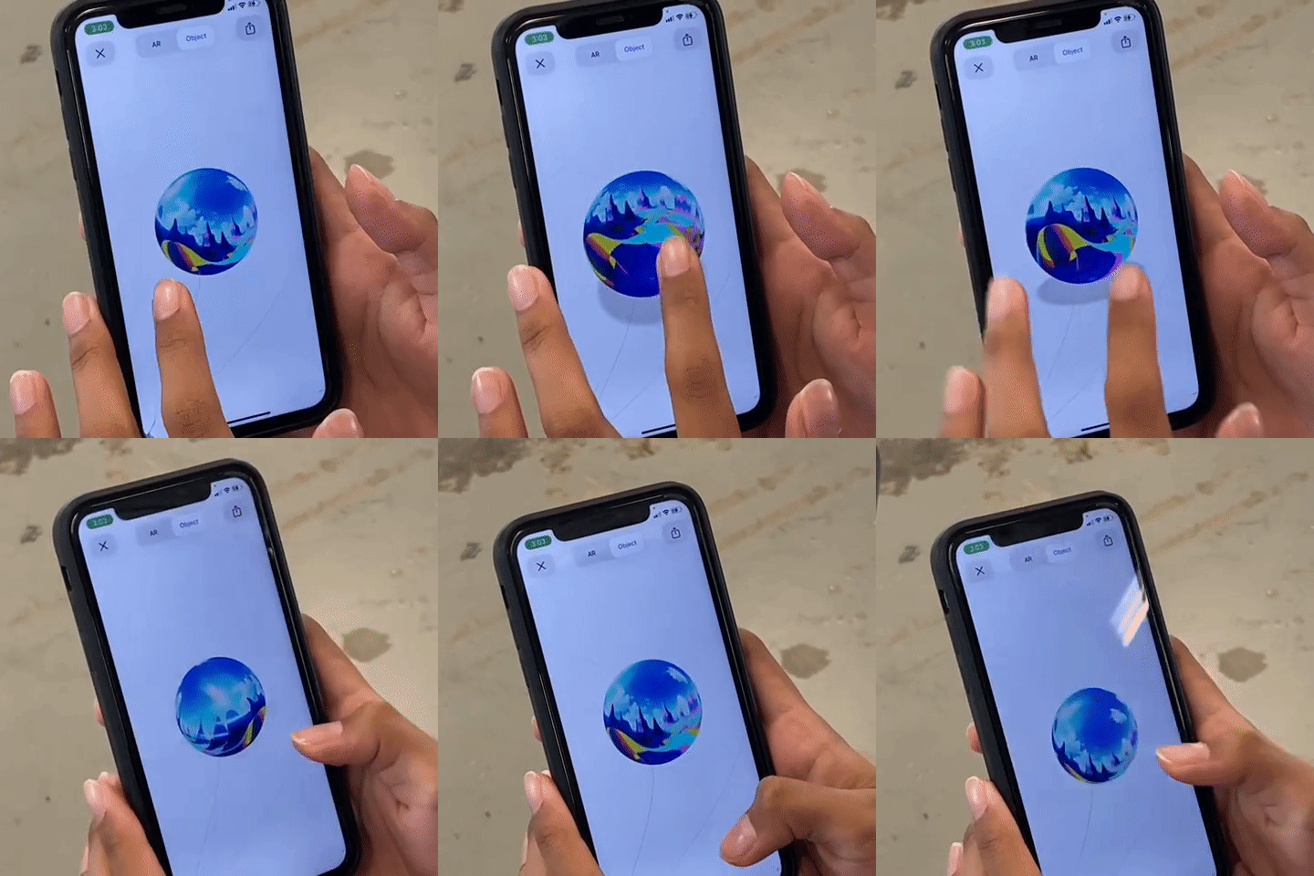
From the very beginning, our main idea has changed time and time again, with each change also affecting how people get to interact with our main outcome. Firstly, our idea involved generative code and 3D printing. Then it moved on to a tactile topology. The final idea, which best complemented the use of generative AI, is simulation via augmented reality filters.
Challenges
During our data collection, we encountered a significant challenge—the limited responses from different generations following the distribution of our survey. The majority of the feedback primarily came from Gen-Z and some Millennials, creating an imbalance across the three generations (Gen-Z, Millennials, and Gen-X). This led us to reconsider our initial plan of exploring how distinct generations perceive music. Although this deviated from our original objective, we decided to adapt and find an alternative approach to ensure the project's success. As a result, we shifted our focus to examining how individuals, regardless of their generation, visualize musical landscapes.
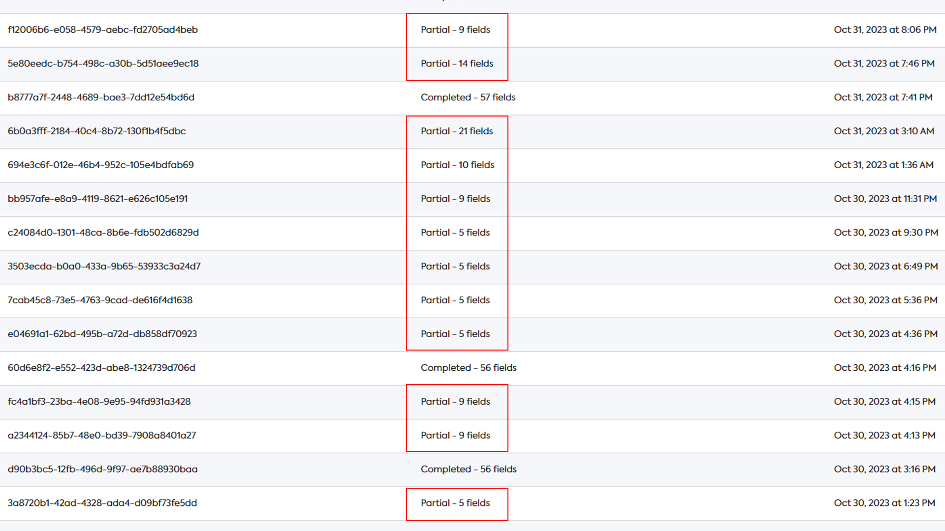
Another hurdle we faced was the incomplete responses to our survey. Many participants didn't finish the form due to its extensive length, causing concerns about insufficient information for our project. With time constraints looming and the need to commence the creation of our artifact, this issue seemed particularly challenging. Surprisingly, the extended nature of our survey, despite the unfinished responses, proved beneficial. We still acquired an excess amount of information, making the process more manageable as we had just the right amount of data to organize and incorporate into our project.
Our initial concerns and doubts were overshadowed by a sense of pride in our work and reflection on the substantial progress we had made since our initial meeting.
Feedback
Before embarking on the Data Spaces project, our team faced a bit of a confidence dip due to less-than-ideal feedback on a previous smaller assignment. This initial setback led to apprehensions about the reception of our work for the current project. We grappled with uncertainties, questioning whether our efforts were headed in the right direction. Despite these hesitations, we actively sought consultations to ensure our project was on track and to identify any gaps in our concepts and ideas.
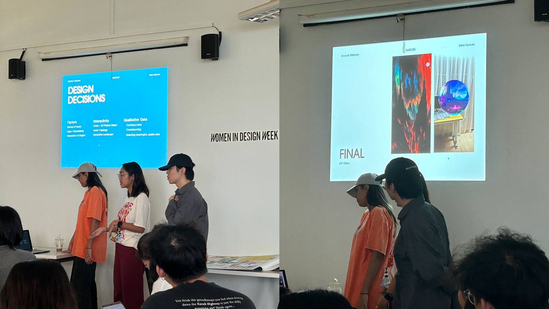
In the early stages of consulting, we approached discussions with confidence, aiming to solidify our concept and ensure its coherence. However, each consultation seemed to introduce new challenges and gaps, derailing our initial ideas. This pattern eroded our confidence until the first presentation, where positive and constructive feedback finally propelled us forward. Post the initial presentation, we encountered numerous obstacles, and our ideas continued to shift and evolve throughout various project stages, from data gathering to the ideation process for our artifact.Approaching the final presentation, nervousness loomed as we feared our artifact and outcomes might not receive favorable feedback. To our delight, we received positive reactions from classmates and lecturers, dispelling our anxieties.
Some of the feedback highlighted the detailed and clearly presented data, the evident experimental curve and improvement in our process over time, and the commendable decision to collect ample data, providing flexibility for experimentation rather than rigidly sticking to a predefined result.
In summary, the final feedback was overwhelmingly positive, acknowledging the richness of our data, the clarity of our process, and the intriguing final outcome rooted in the survey results.
Achievements
After weeks of uncertainty and constant changes to our project, a major win was finally receiving positive feedback from our lecturers. We went through a lot of doubts and kept tweaking our ideas. Overcoming the challenges during meetings and seeing a positive response in our first presentation really boosted our confidence. The best part was when our lecturers said they liked what we did, recognizing how our project evolved and the smart decisions we made despite all the changes. Getting their approval felt like a major win, showing that we stuck with it and adapted well throughout the project. Plus, it was so cool when our classmates were impressed and went "Woahh!" when we showed them the AR filter. It made all the hard work feel totally worth it!
